Annapurna – Kitchen Ordering System
Bringing ease, clarity & coordination to workplace meals
Project Overview
Annapurna is an internal food ordering system designed for workplace use. Employees can view daily menus and place orders, while the kitchen team manages menus, tracks orders, and updates availability. The goal was to create a seamless, user-friendly platform for both employees and kitchen staff — replacing paper slips, WhatsApp orders, and confusion.
The Problem -- Before Annapurna, food orders were handled through messages and word of mouth. This led to misplaced orders, confusion on availability, and zero tracking. Kitchen staff didn’t know how much to prepare, and employees weren’t sure what was available or when it would arrive.
Team
Collaborated with kitchen staff, admin, and employees across departments.
Role
Led end-to-end design — user research, flows, UI design, and interaction.
User Roles Defined
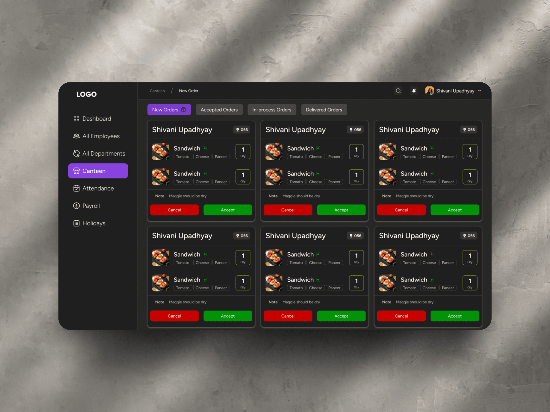
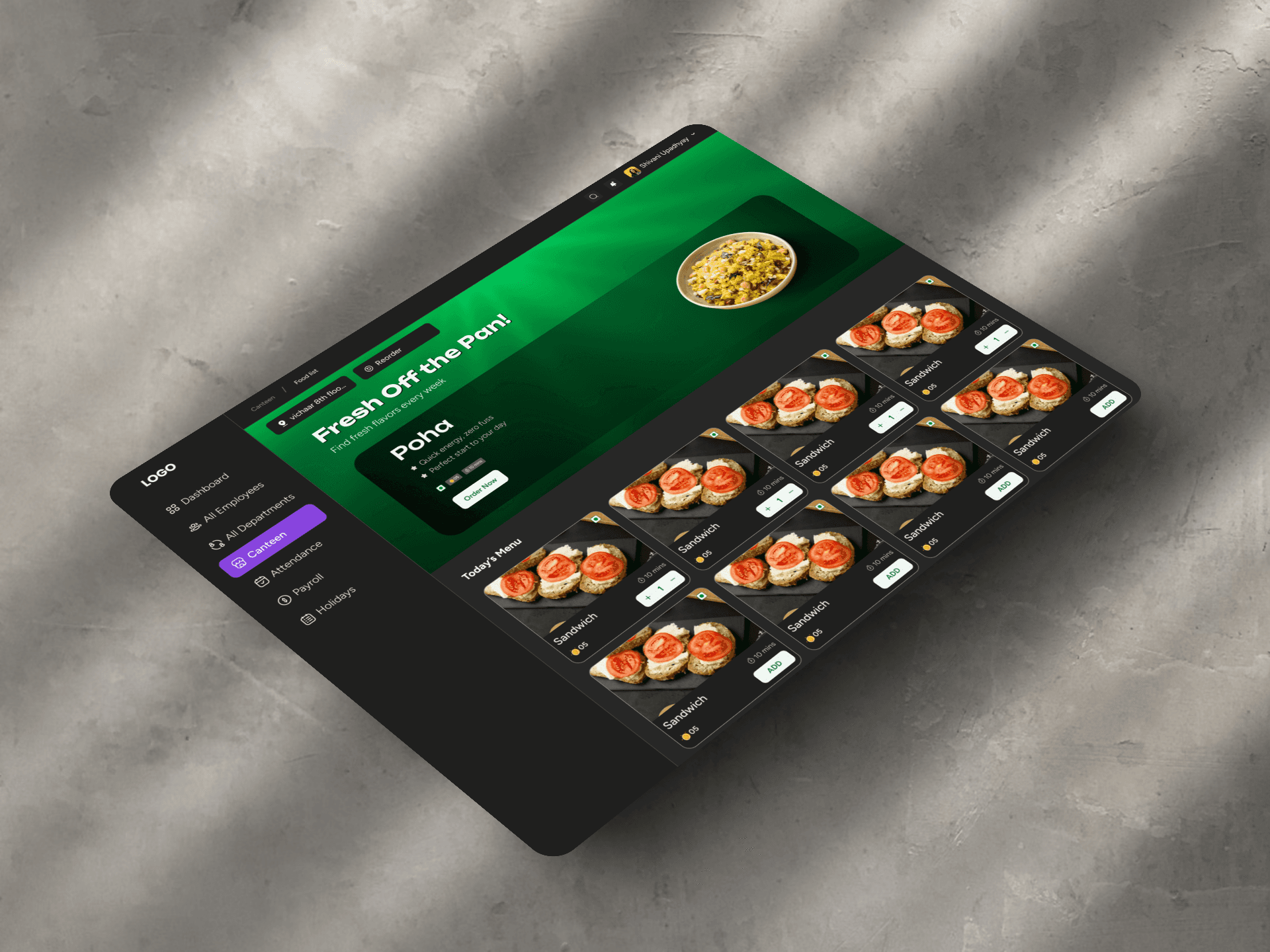
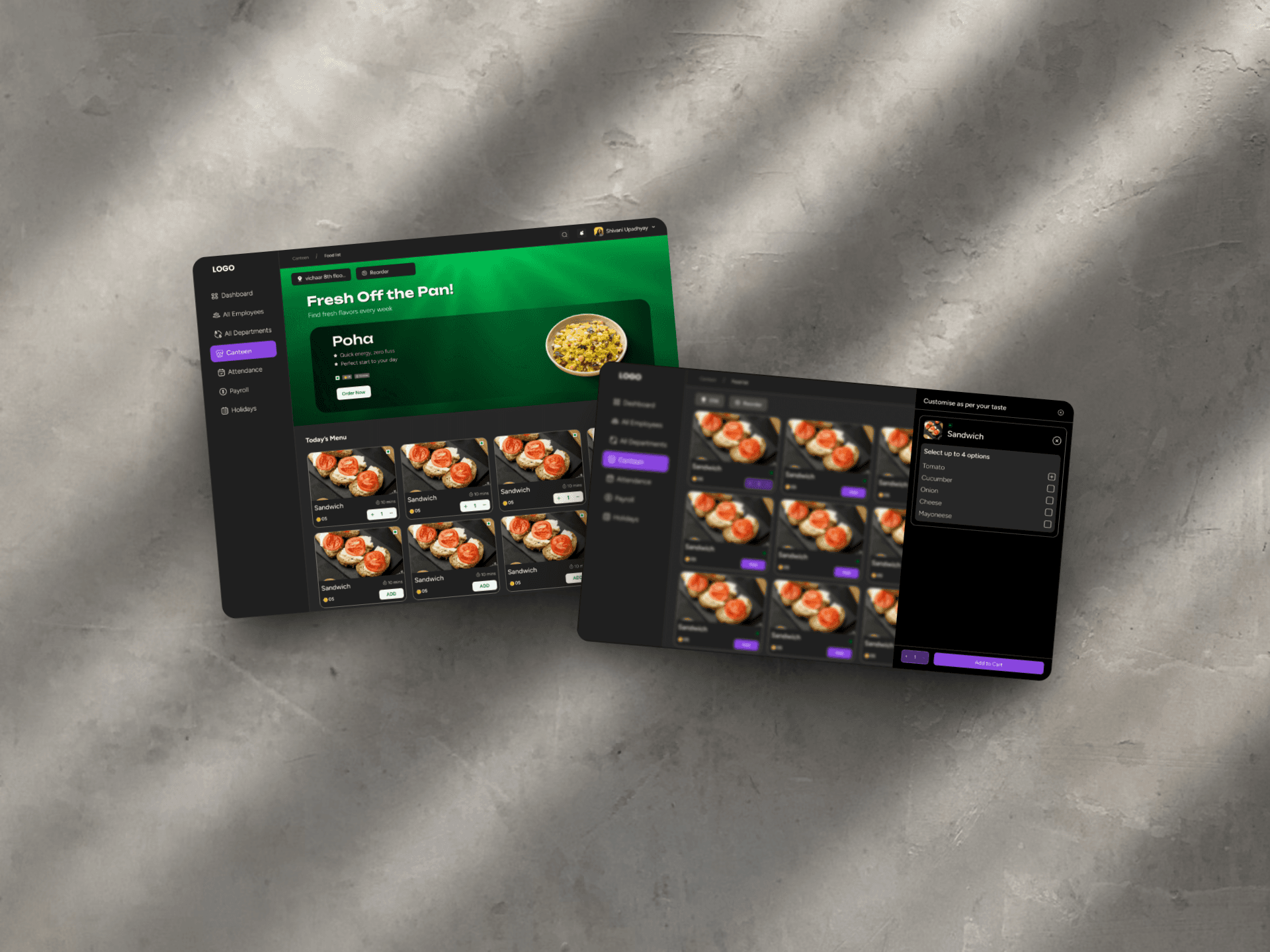
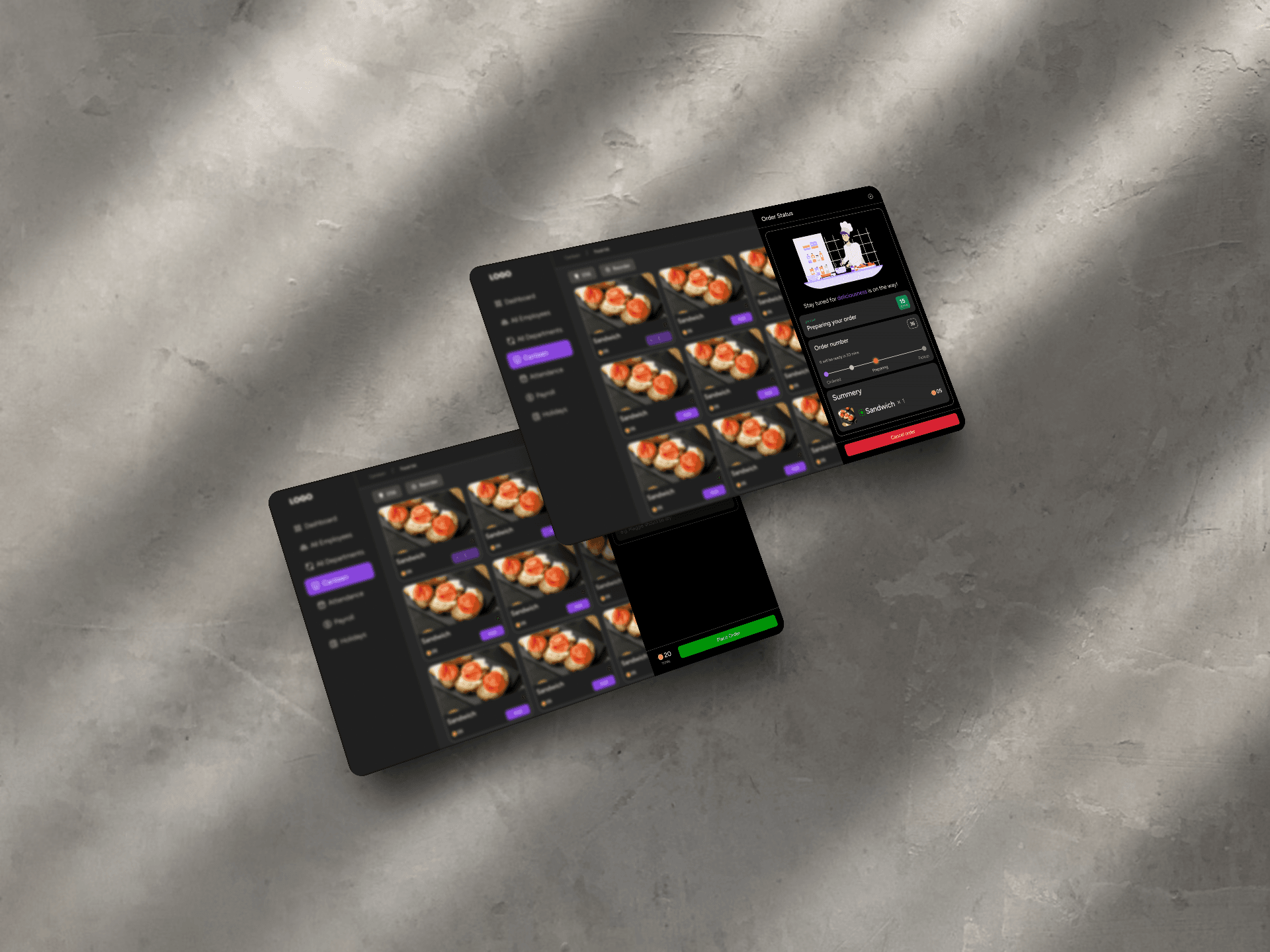
We designed with two primary roles in mind: Employees – View menu, place/cancel orders, track order status Kitchen Team/Admins – Upload daily menu, manage orders, view counts Each role had its own dedicated view and tasks, reducing clutter and confusion.
Key Modules Designed -- - Employee Dashboard – Simple list of today’s menu, with clear “Order” and “Cancel” buttons - Order Status View – Shows if your order is confirmed, being prepared, or ready - Kitchen Panel – Upload menu items, set quantity limits, view real-time orders - Order Summary Panel – Gives the kitchen a clear view of total demand per item Design stayed focused on clarity and speed — most users interact with the app daily, so flow had to be quick and obvious.
How We Designed It (The Real Way It Happened)
We Listened First We started by just listening — to the kitchen team’s chaos, the employees’ lunch-time struggles, and all the “little hacks” they used to get food on time. No surveys. Just conversations, real stories, and a few frustrated laughs. We Sketched the Day We mapped out everyone’s typical lunch day — from deciding what to eat to standing in line or texting the kitchen. This helped us spot the pain points before even touching a screen. We Built Light Instead of jumping to full screens, we created simple tap-through flows. Just enough to show people, “Hey, would this work?” We printed a version for the kitchen team to mark with pens! We Designed for the Real World Big buttons for busy hands. Simple status updates. Limited choices so it’s fast. We didn’t design to impress — we designed to work during a real lunch rush. We Tweaked as We Went Feedback didn’t come all at once. It came in kitchen breaks, late pings, and random “Can we also do this?” We embraced it — tweaking one thing at a time until it just felt right for everyone.
Outcome
Food orders became 100% trackable — no more guesswork or repeated messages. Employees found it quicker and easier to place orders — most used it daily on their phones. Kitchen staff saved time and effort, thanks to live order counts and auto cut-off timings. Communication dropped — the system quietly handled what used to take group chats and reminders. The design was made fully responsive, optimized especially for mobile use since most users interacted on their phones between tasks.
---------------------------------------------------------------------------------- Smart Features That Made a Difference -- Daily Menu Control – Kitchen could upload menus in advance and mark items unavailable when needed. Order Cut-off Timing – Orders automatically locked after a set time, helping the kitchen plan and prepare. Live Order Count – Real-time tally of each dish helped reduce over-preparation and food waste. Order Status Tracking – Employees could check if their order was confirmed, in progress, or ready — without asking.